The
Sketch
Blacklist
When members of this sketch comedy group wanted some sort of graphic to represent a project they were putting together, the informal design brief was as follows:
So, in an experimental approach in the spirit of the assignment, I thought for a first round, to be extreme and go for all of it in as big a way as possible...

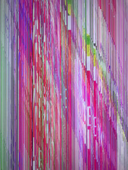
I often try to pull in design elements from the city and everyday environments. In this case, the color palette was inspired by a glitchy street sign that caught my attention on the way home.
From there, we decided to scale it back a bit, picking out pieces that could be separated out to communicate the same overall gist of feeling and idea but with less going on.
With the clients having liked this second round, we whittled it further and in the end got it down to this:

Call me crazy, but I'm still sort of fond of the vivid eyeball aching wildness of the first one. Still, that's the appeal of this type of work for me, pulling disparate elements together, experimenting and experiencing the process.


